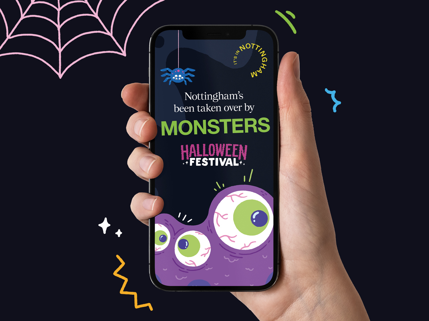
We’ve been continuing our partnership with It’s in Nottingham – following the brand refresh we delivered earlier this year – through ongoing campaign work. The first of which is for Nottingham Halloween Festival, an annual event that includes heaps of activities, events and initiatives all delivered by It’s in Nottingham.
With the refreshed It’s in Nottingham brand in place, our role has moved onto establishing thoughtful strategy and compelling design work that over time forms a hierarchy across the various programs and campaigns that It’s in Nottingham deliver. That means understanding when things should have their own identities, where things should sit in relation to the IiN masterbrand, and how things work as a visual and verbal system to ensure value and equity is created for the right parts of the hierarchy at the right times.
Therefore, establishing the necessary creative flex there is for each campaign – how much ‘newness’ should be applied versus how much of the masterbrand’s visual language each campaign borrows and utilises – is an important consideration.
For Halloween, our approach was to build out a new identity of sorts while ensuring that all communications tie back to the It’s in Nottingham masterbrand to ensure it received overall credit for the event. That gave us the flexibility to inject some fun and engaging personality into the campaign’s creative, which we gladly took advantage of…
Working alongside illustrator Matt Joyce, we developed a series of Halloween Festival assets – from a campaign identifier to monsters and small cameo illustrations. Monsters play a key part of the campaign as they are a feature piece for the event, with several huge inflatable monsters being installed throughout the city during the festival. The quirky illustration style lends itself perfectly for animation, which we utilised across digital assets including social media and screen adverts around the city to dial up the fun factor and add visual interest to communications.
The campaign borrows several elements from the IiN masterbrand, including typefaces and colours, but repurposes them in distinctive ways to ensure things feel appropriate for the event and its audiences. Things are deliberately bold, loud and fun – setting the tone for the overall Halloween Festival experience. As well as digital assets, we also delivered print materials including various physical adverts and a bespoke map for city centre visitors to follow trails around the city and take in everything the festival has to offer.
Overall, the campaign’s creative is the first in an upcoming series of work that will set the benchmark for the It’s in Nottingham brand’s ongoing communications.
A fun project to be a part of, and one we’re excited to see continue to be rolled out as the festival unfolds!
Like what you see? Drop us a note to set up a chat.

