
PowerFlow
Putting the energy into power delivery
Carillion, one of the UK’s largest infrastructure and utilities companies, had created a revolutionary new product with the potential to transform the power delivery marketplace for the better.
Wanting to create noise about its launch, we were trusted to undertake in-depth research, strategy development, naming and brand language definition for the new product, which needed to be supported by literature, brand guidelines and a stunning launch campaign.


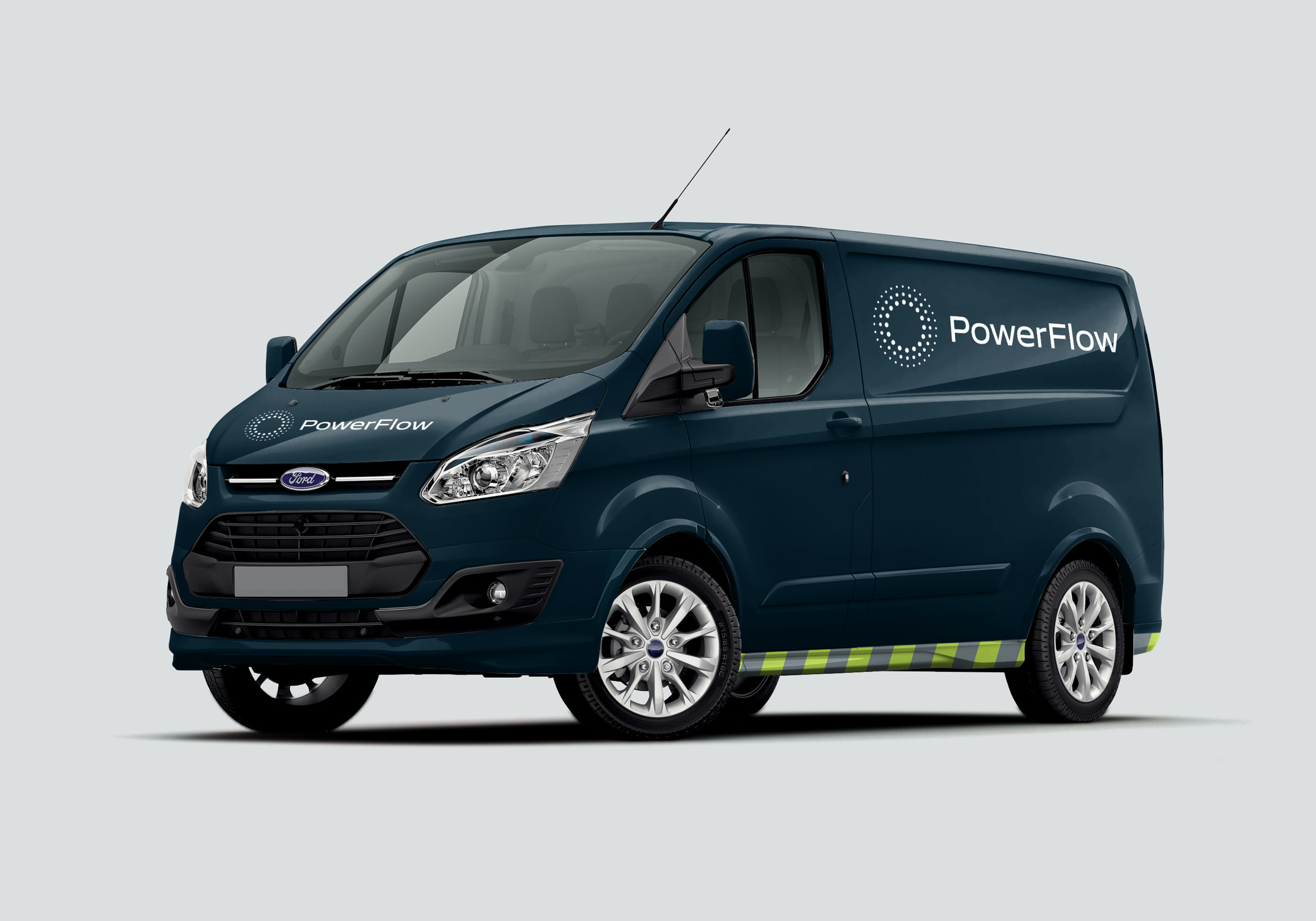
With a symbol that featured concentric circles – more prominent towards the centre and lighter on the outside – we conveyed the true power behind the new technology and the efficiency benefits it delivered.

“Cubic created an innovative visual system that felt brand new yet completely familiar – exactly what our brief requested.”
Joanne Wilkins
Product Development Director, Carillion