While a logo is never a brand in its entirety, it can become the backbone a brand needs to help tell its story. That’s why, for Wild Rutland, we went the extra mile to ensure its identity did the job its brand needed it to do from day one.
The love, care and attention to detail that went into the conception and craft of the Wild Rutland identity – and its supporting toolkit – demonstrates the heart and soul we put into the brands we work on. Considerations such as longevity, accessibility and standout are all top of mind during the design process – alongside the intention to build as much meaning as possible into every single component that makes it up.
With the project following our strategically-led process, we began by developing several visual concepts that brought the Wild Rutland brand idea – ‘Step into nature’ – to life before working with our client to select a preferred design route.
Typically, minor refinements follow this stage. But whenever we think it’s necessary, we work with specialists in the craft of tweaking, honing and enhancing symbols and wordmarks to make them the best they can possibly be. For Wild Rutland we worked with London-based type and lettering artist Rob Clarke, who supported us on the journey by bringing a fresh perspective and another level of artistry to the project.
Our intention for the Wild Rutland logo was twofold:
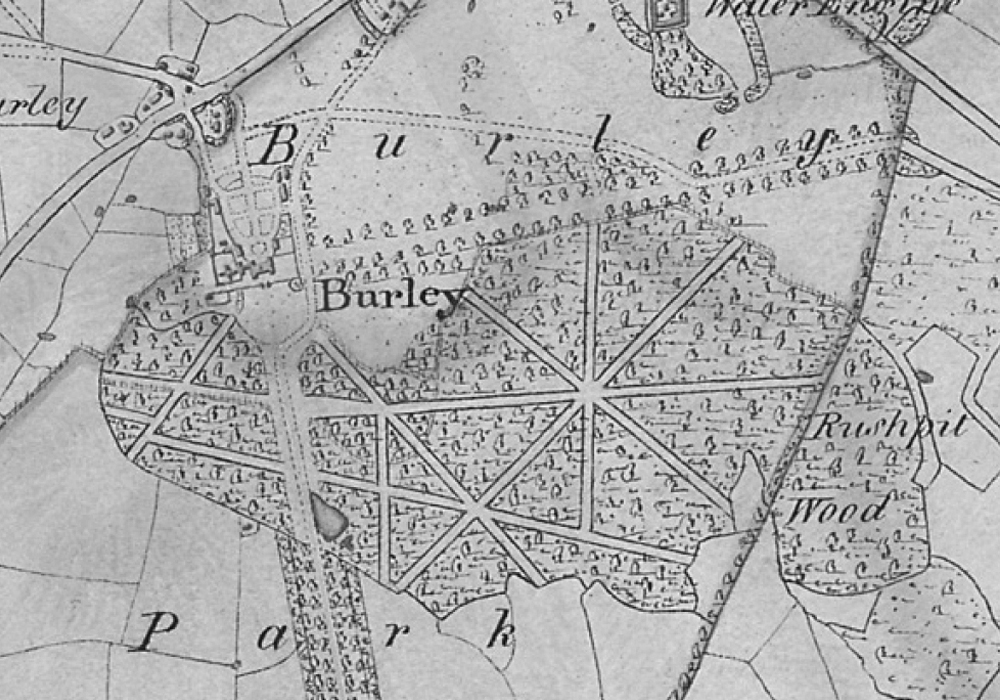
– A tree symbol and shape inspired by the landscape of the proposed site
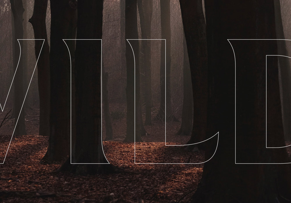
– A typography styling inspired by the trees within the site’s woodlands – specifically the strong uprights and curvatures at the base of the tree trunks which informed the type weight and the flared serifs, and the shapes of the trees’ leaves which added subtle sculpting features throughout
To ingrain those ideas, and ensure the final result was as beautifully crafted as possible, we embarked on a series of subtle alterations. These started broad, almost as trial and error experiments, in order for us to understand and explore how best to weave the thinking and ideas behind the brand into its visual form. We then moved into a phase of careful craft and precision – with numerous subtle alterations each pushing the identity to completion, before it became locked down and ready to use.
That love and care is easy to miss for those not as close to the project as we were. But, like everything in life, if you sweat the details and strive for perfection the results will be there for all to see. In this case it’s a beautifully shaped identity that forms part of a meaningful and future-proofed brand.
If you like what you’ve seen or read, get in touch to find out more. We’re always up for a chat.

