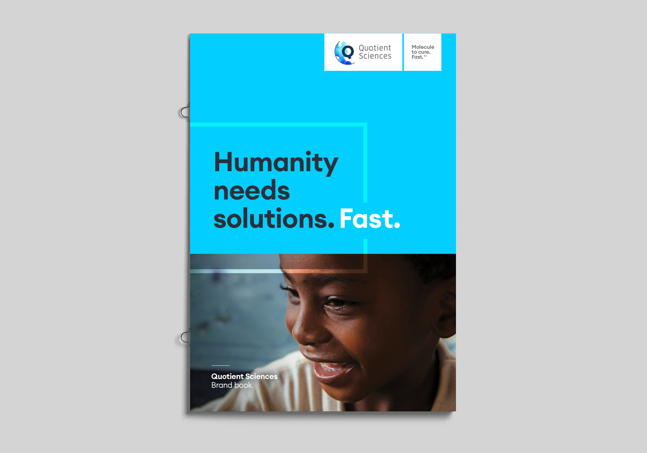
Quotient Sciences
Unveiling the soul of a pharmaceutical world-leader
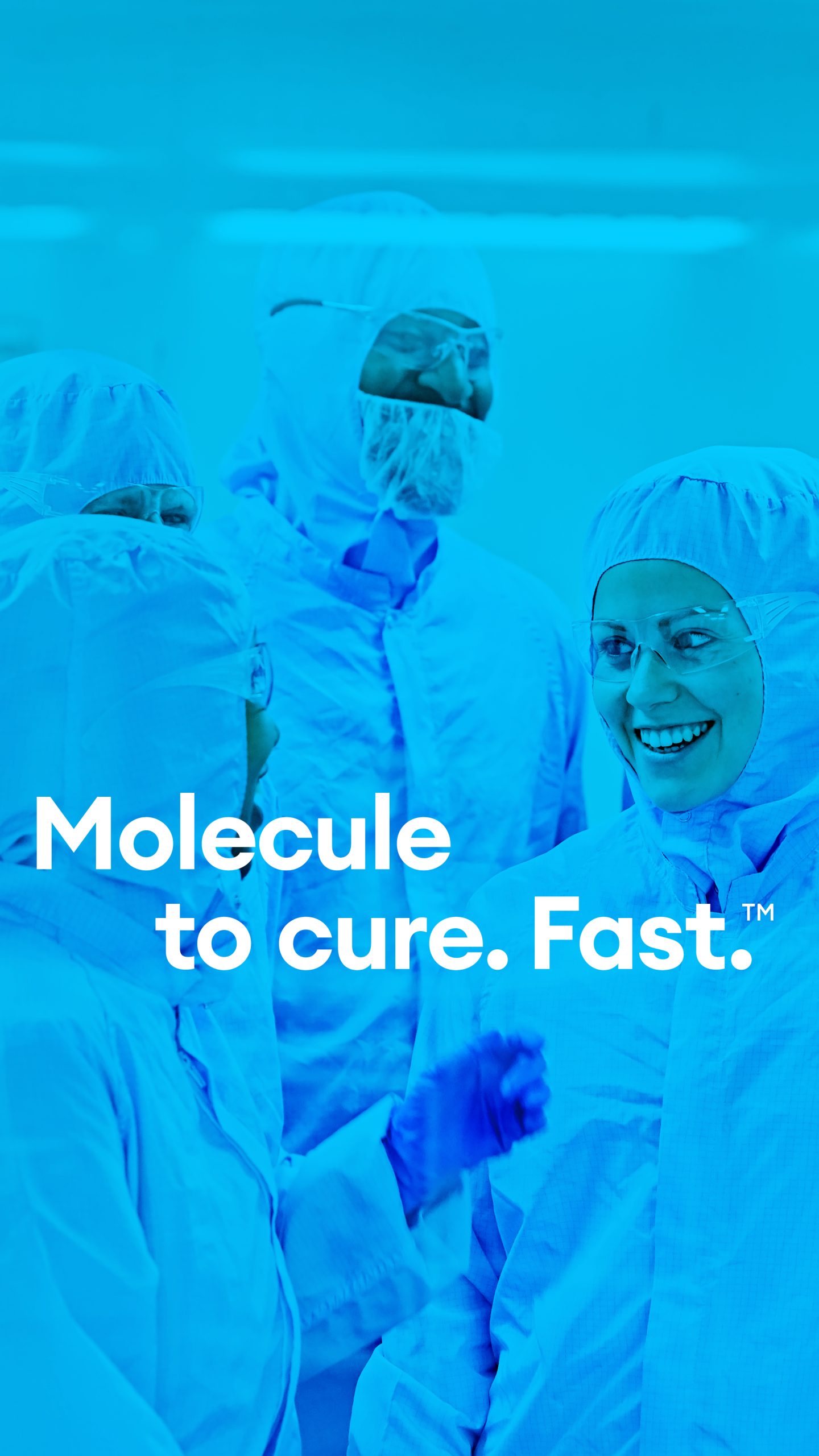
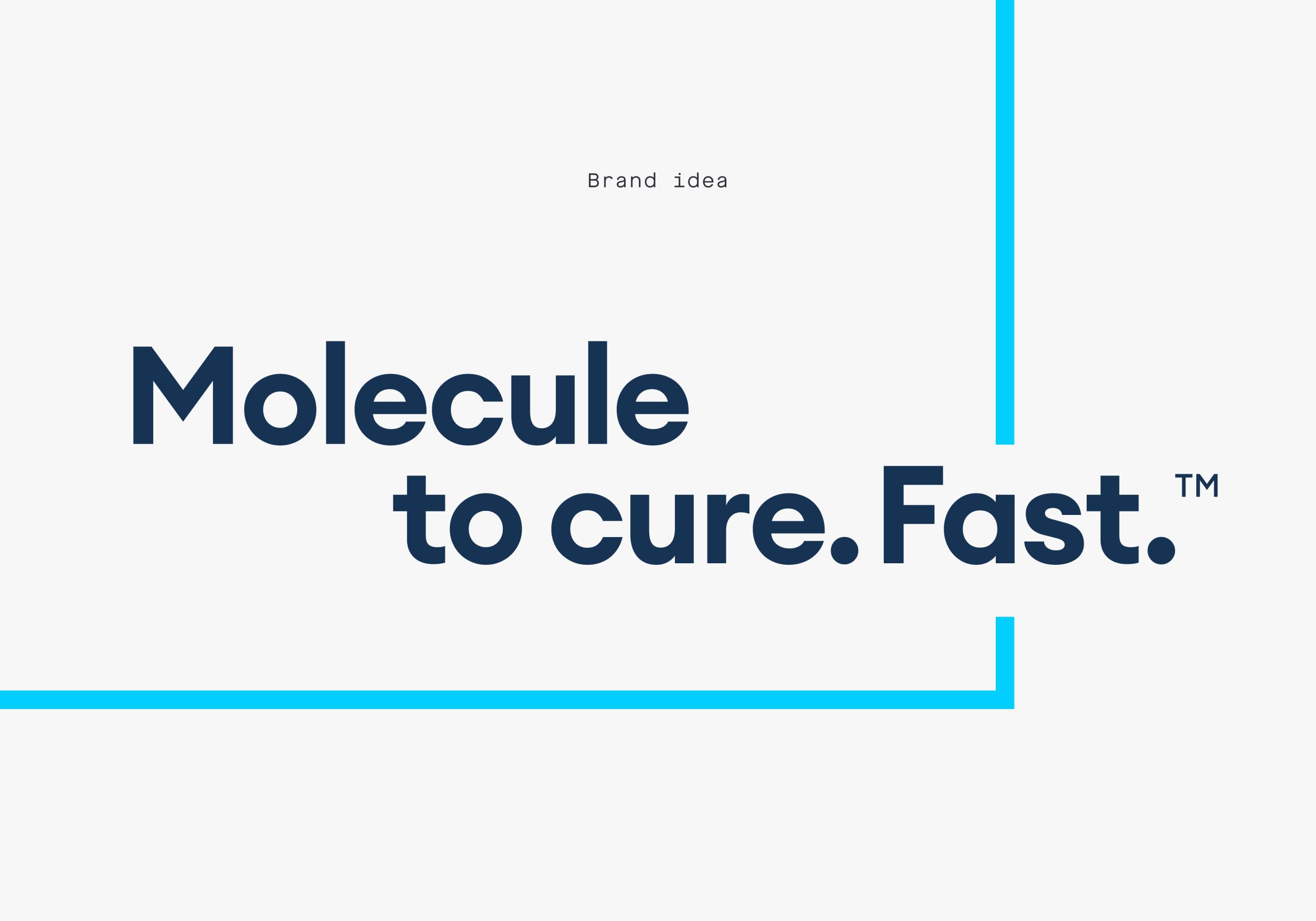
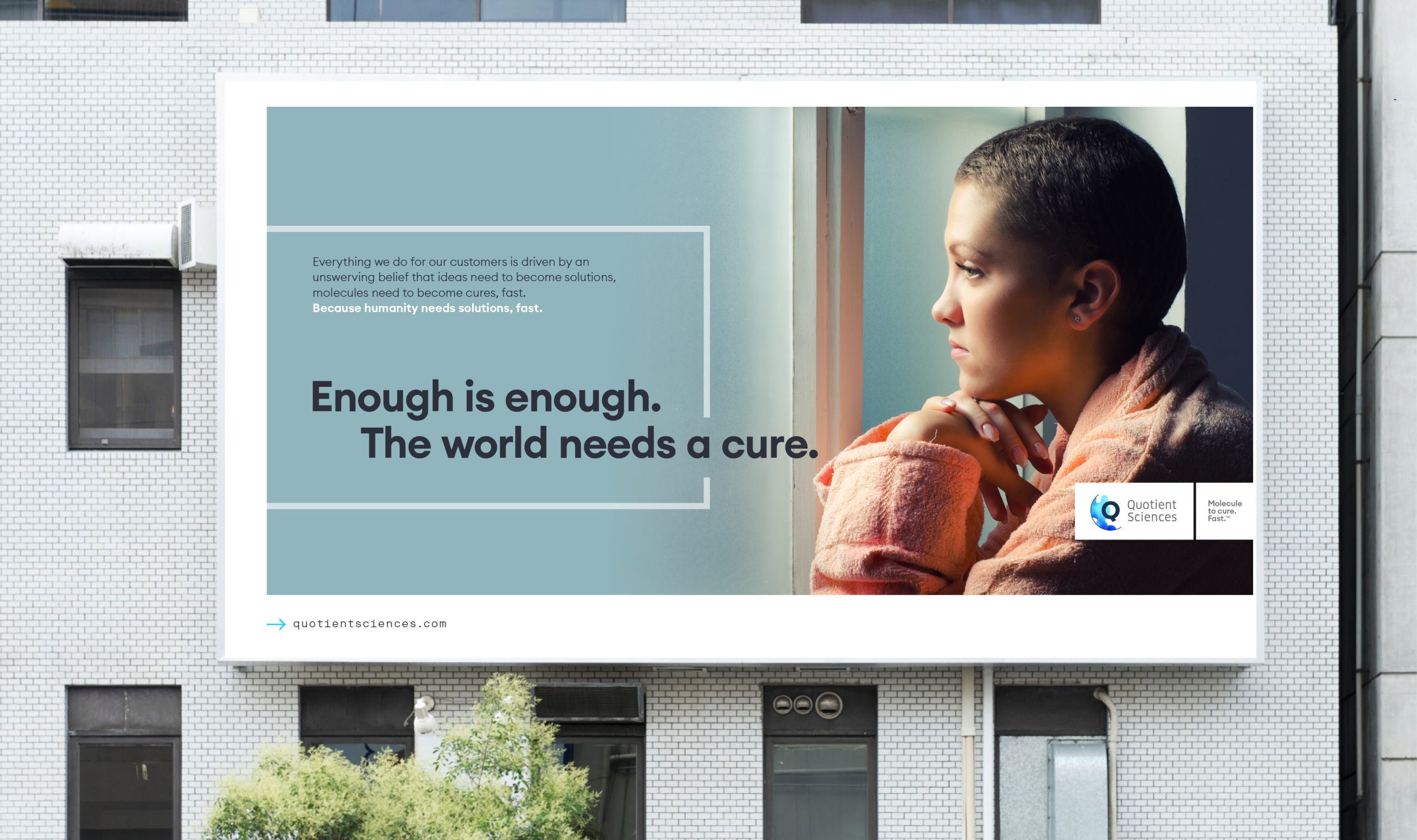
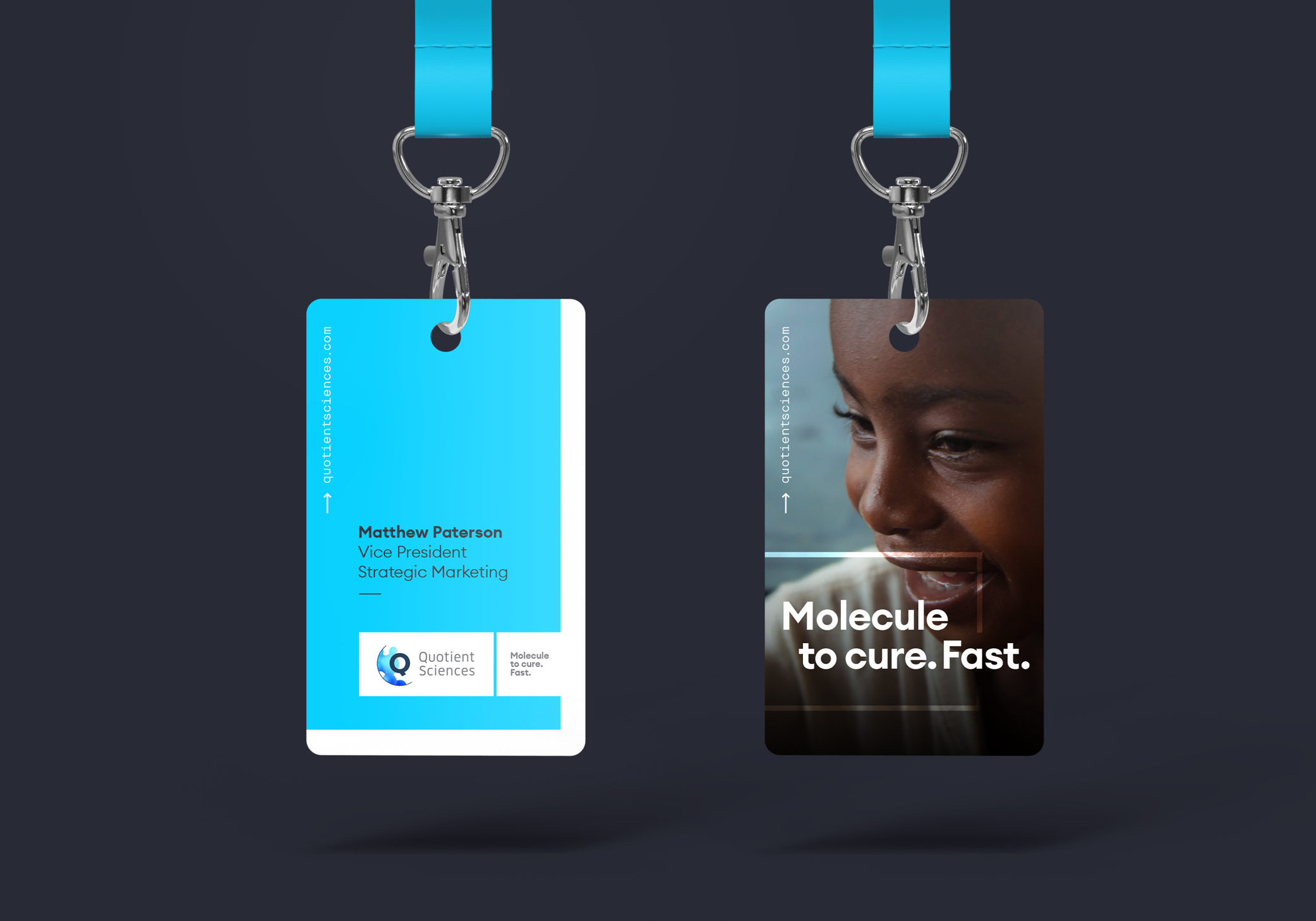
Quotient Sciences is a world-leading drug development and manufacturing accelerator. Through integrated programs and a range of tailored services, Quotient dramatically shortens drug development times for its customers – enabling molecules to become cures as quickly as possible.
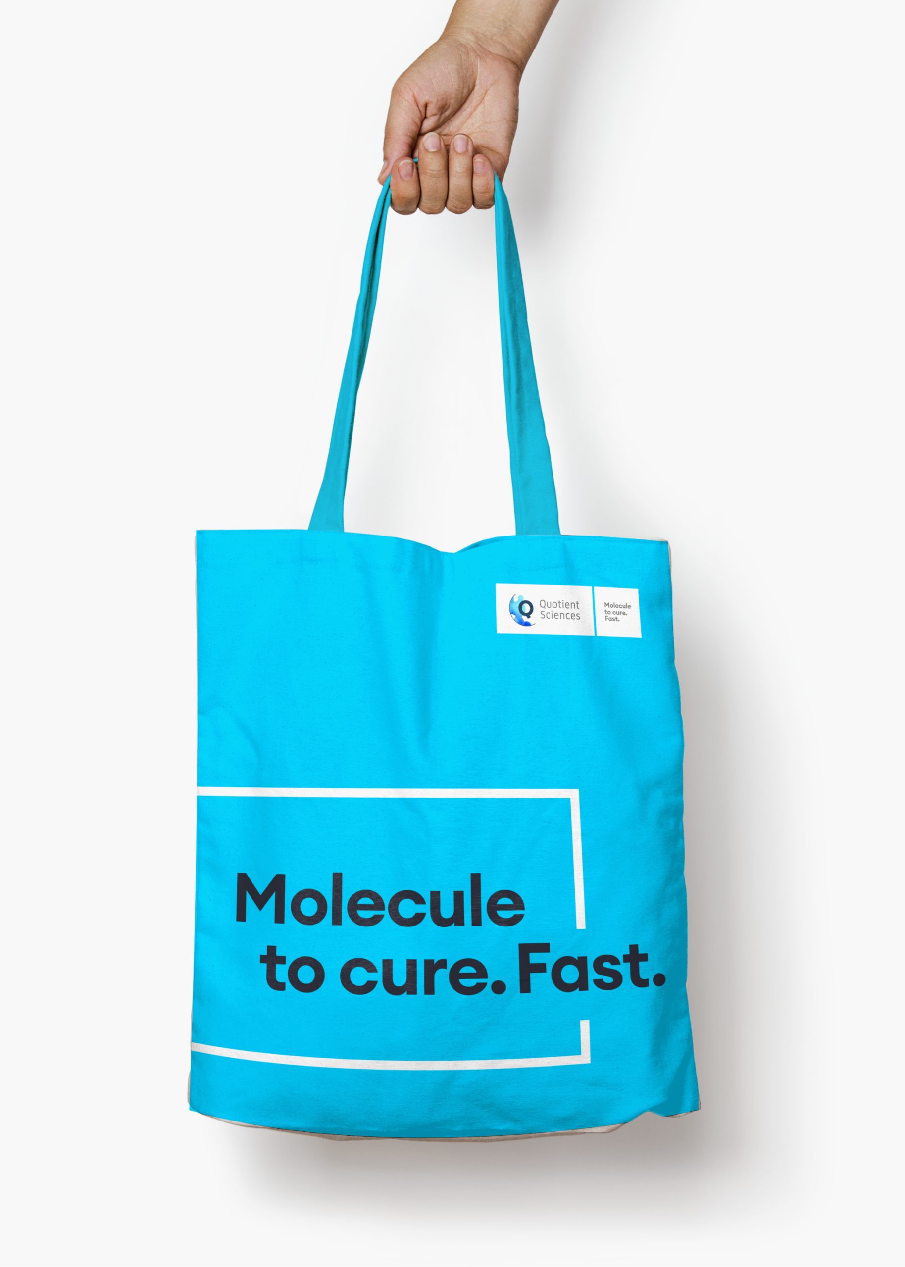
Over the course of our eight year partnership, we’ve helped the Quotient brand push boundaries – culminating in a refresh project that expressed its difference wholeheartedly. Applied across all key touchpoints, including a revitalised web presence, the rebrand informed a bold new chapter for Quotient Sciences as it continued its growth and realised its ambitions.

Rolled out across key applications – from internal comms and sales materials, to PowerPoint templates and new guidelines – the brand launched at a virtual launch event attended by all Quotient Sciences employees. It marked a new era for the business, and provided an opportunity for its people to feel proud about the company they work for.
Designed with a stronger web presence in mind, we applied the new brand across a new site that helps demonstrate Quotient’s expertise, knowledge and unique approach across every module, interaction state and click-through.
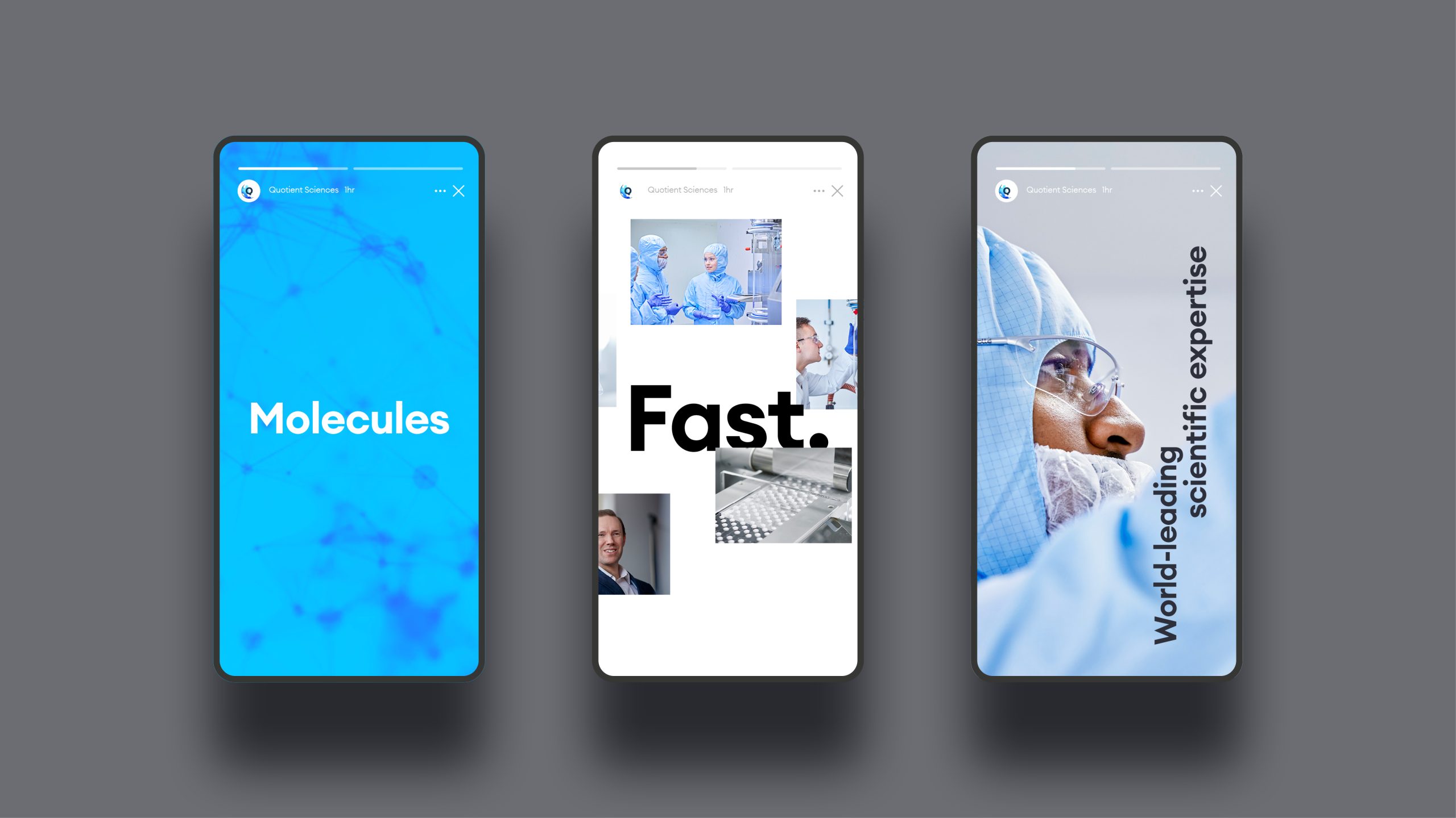
Supported by new assets, such as brand films and animations that introduce various programs and services simply and seamlessly, the new brand was born to thrive across every medium.

“The project marks a step change for Quotient as a business, as we look to affirm our position as a world-leader in drug development and beyond. Cubic’s creativity, attention to detail and design expertise has helped us craft a brand that’s different for all the right reasons. We’re very excited about what it will help us achieve”.
Matthew Paterson
Vice President of Strategic Marketing, Quotient Sciences