It’s in Nottingham
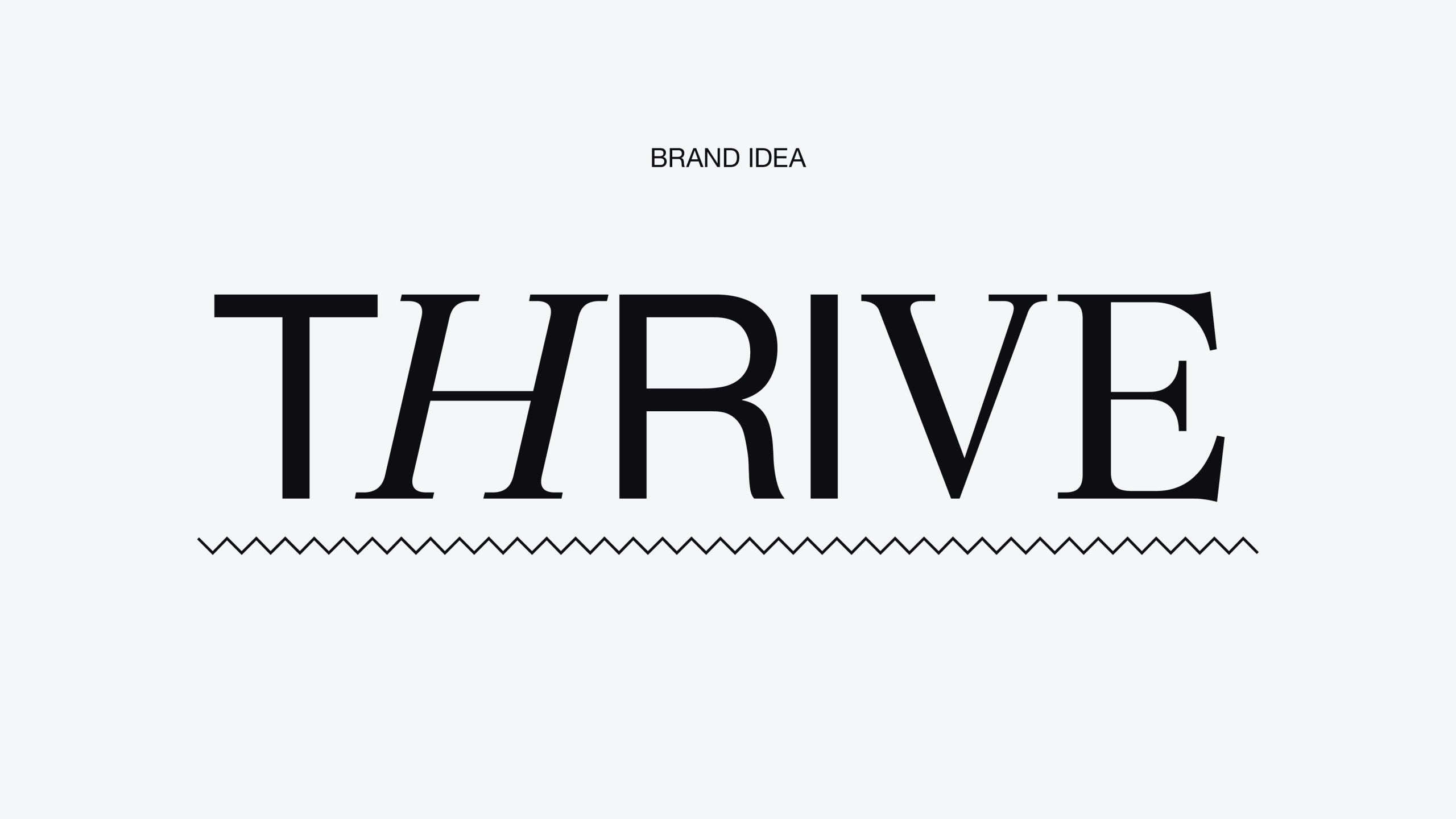
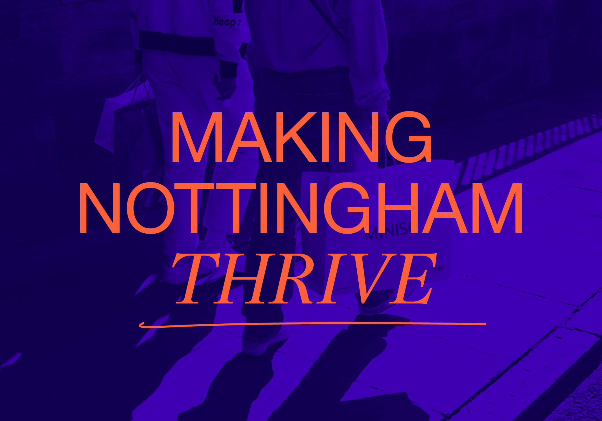
Making Nottingham thrive
It’s in Nottingham is the new name for Nottingham BID (Business Improvement District). With a mission to drive economic growth for Nottingham city centre – making it a better place for people to live, work, study and play – It’s in Nottingham is an independent organisation whose ultimate responsibility is to deliver value for its voting members.
With an old-hat corporate brand that wasn’t fit for purpose, and a consumer-facing brand that was too easily ignored, our job was to rebuild things from the ground up – establishing a new, ambitious presence that could flex to relate to multiple audiences while reflecting the attitude and energy of Nottingham itself.

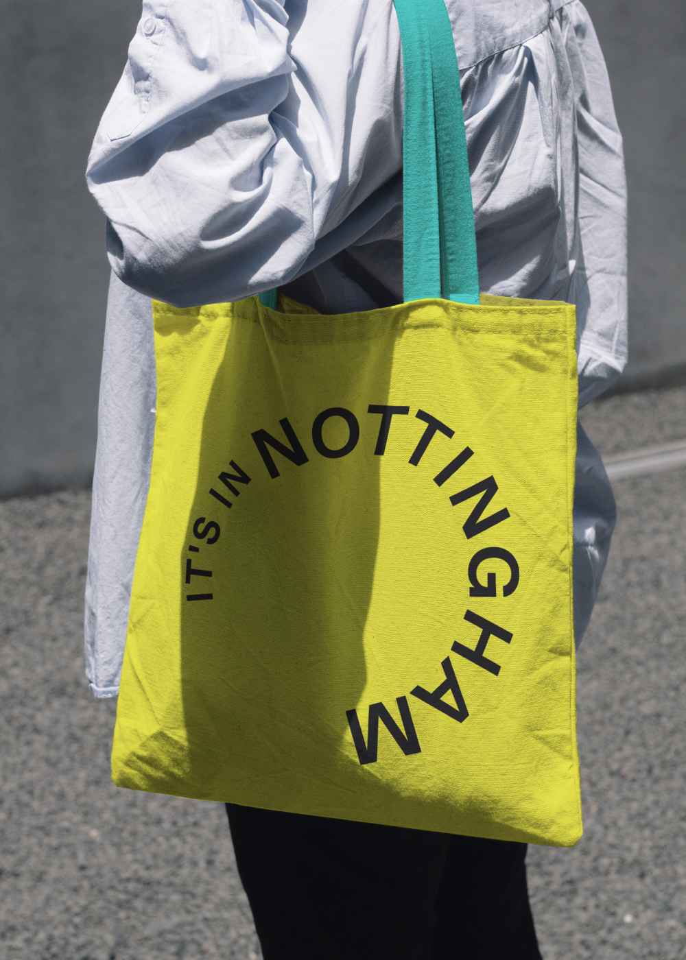
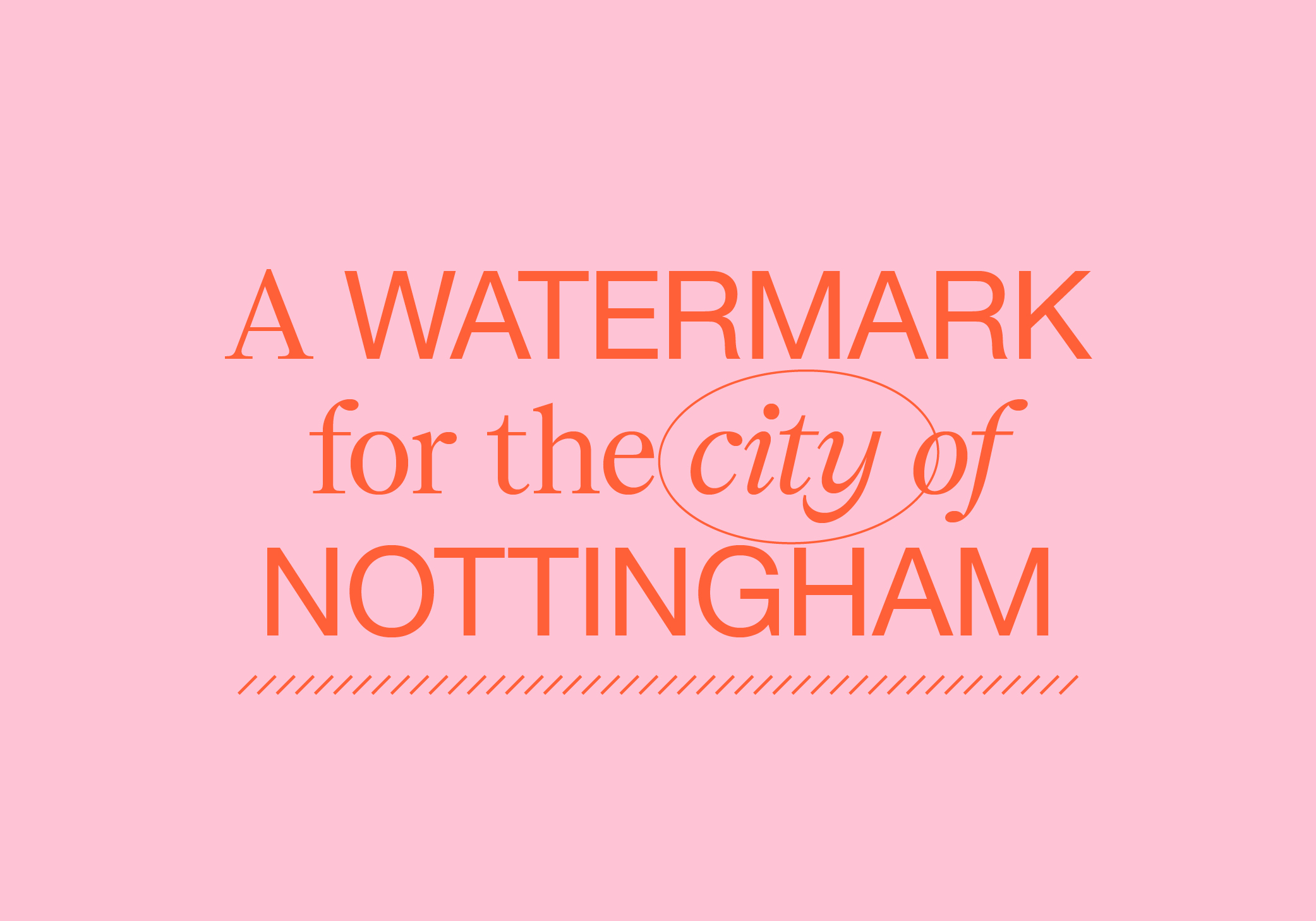
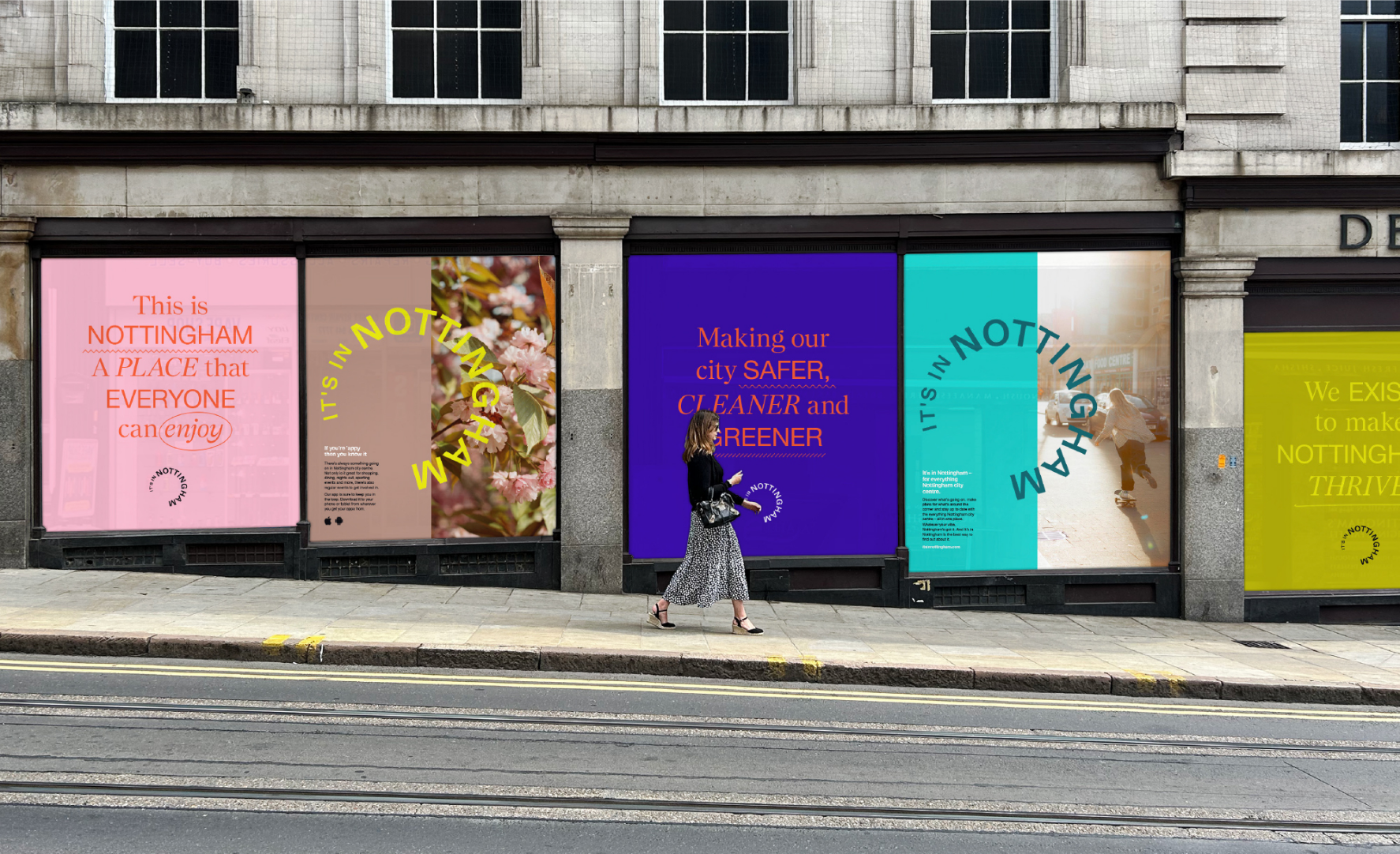
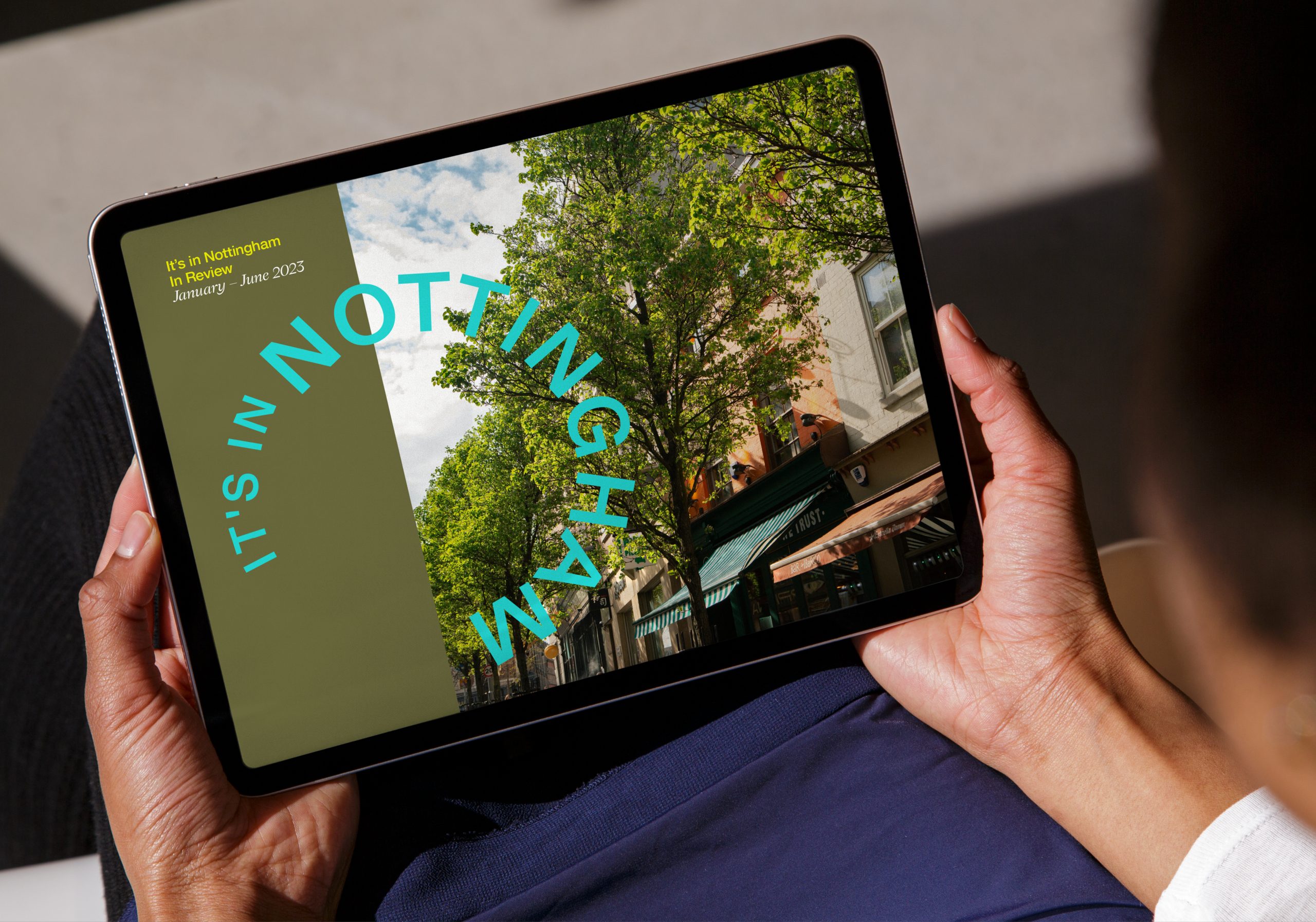
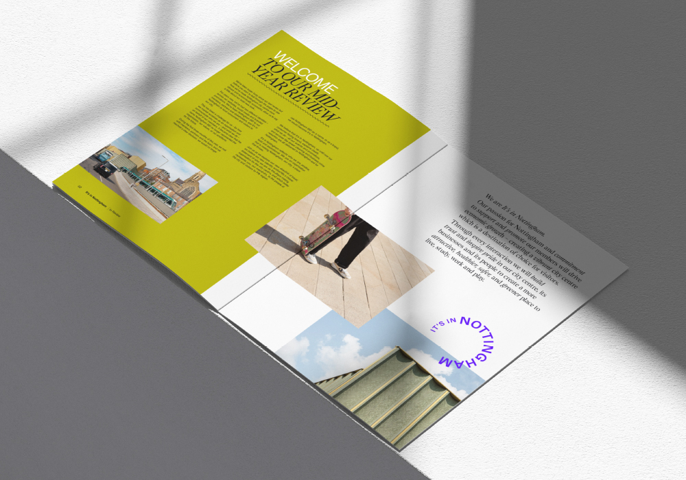
Designed to serve as a watermark for the city – a stamp of authentication – the simple identity allows the playfulness of the brand’s expression to do the heavy lifting.
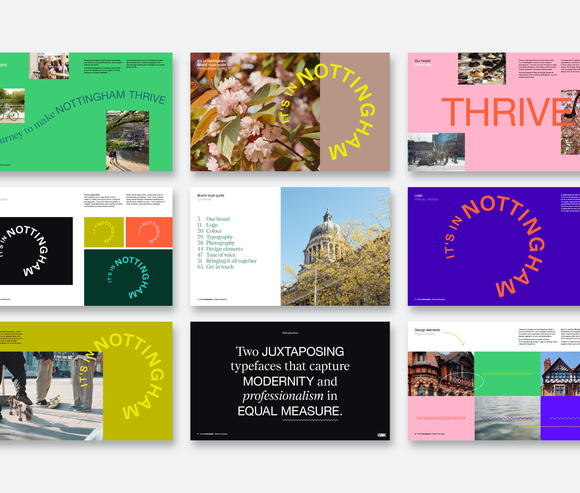
Telling individual stories is made possible through creative treatments that add playfulness and expression at the right times. And a toolkit of design ‘jewellery’, inspired by stripped back patterns from around the city, adds meaningful and thoughtful touches to applications.
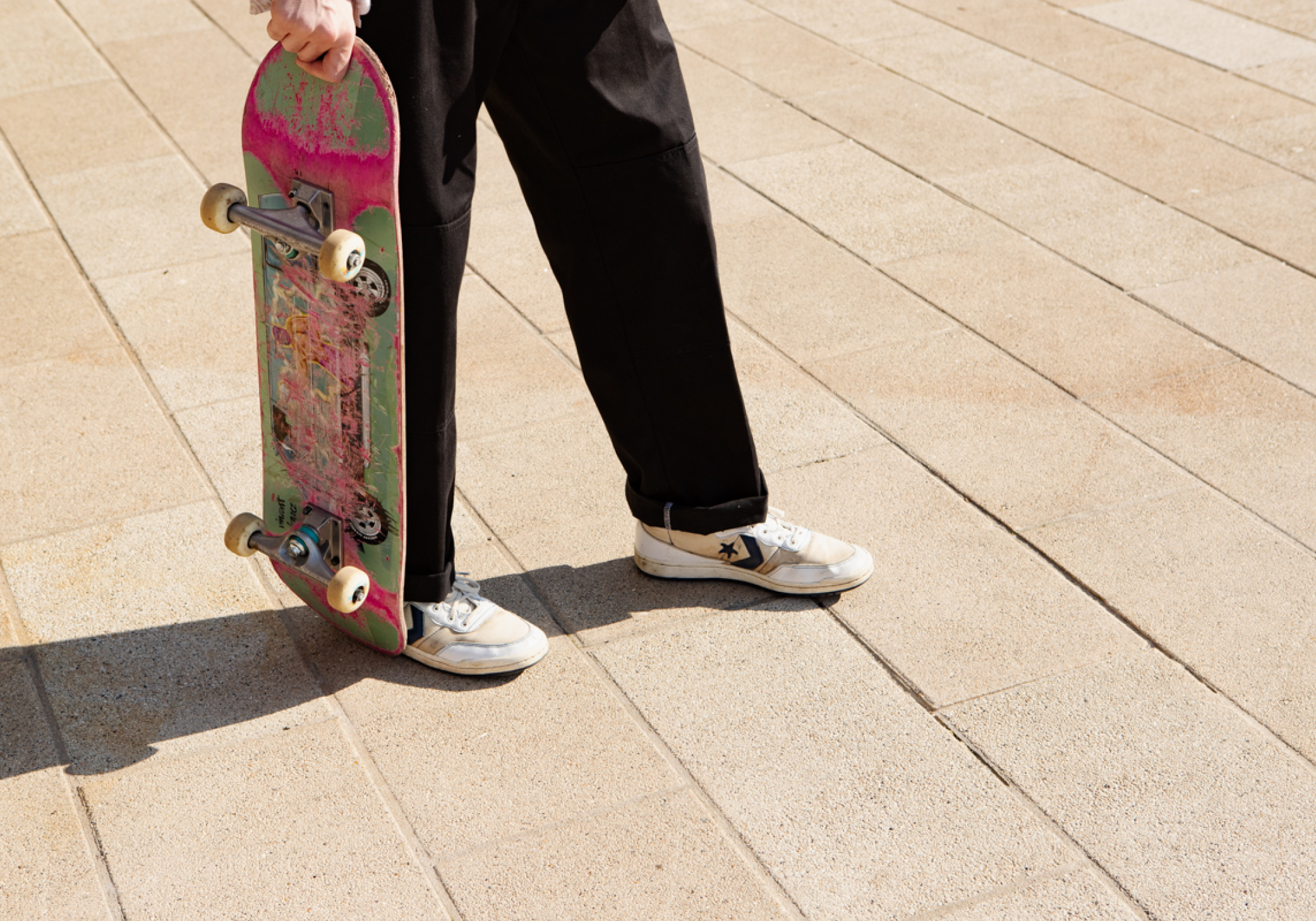
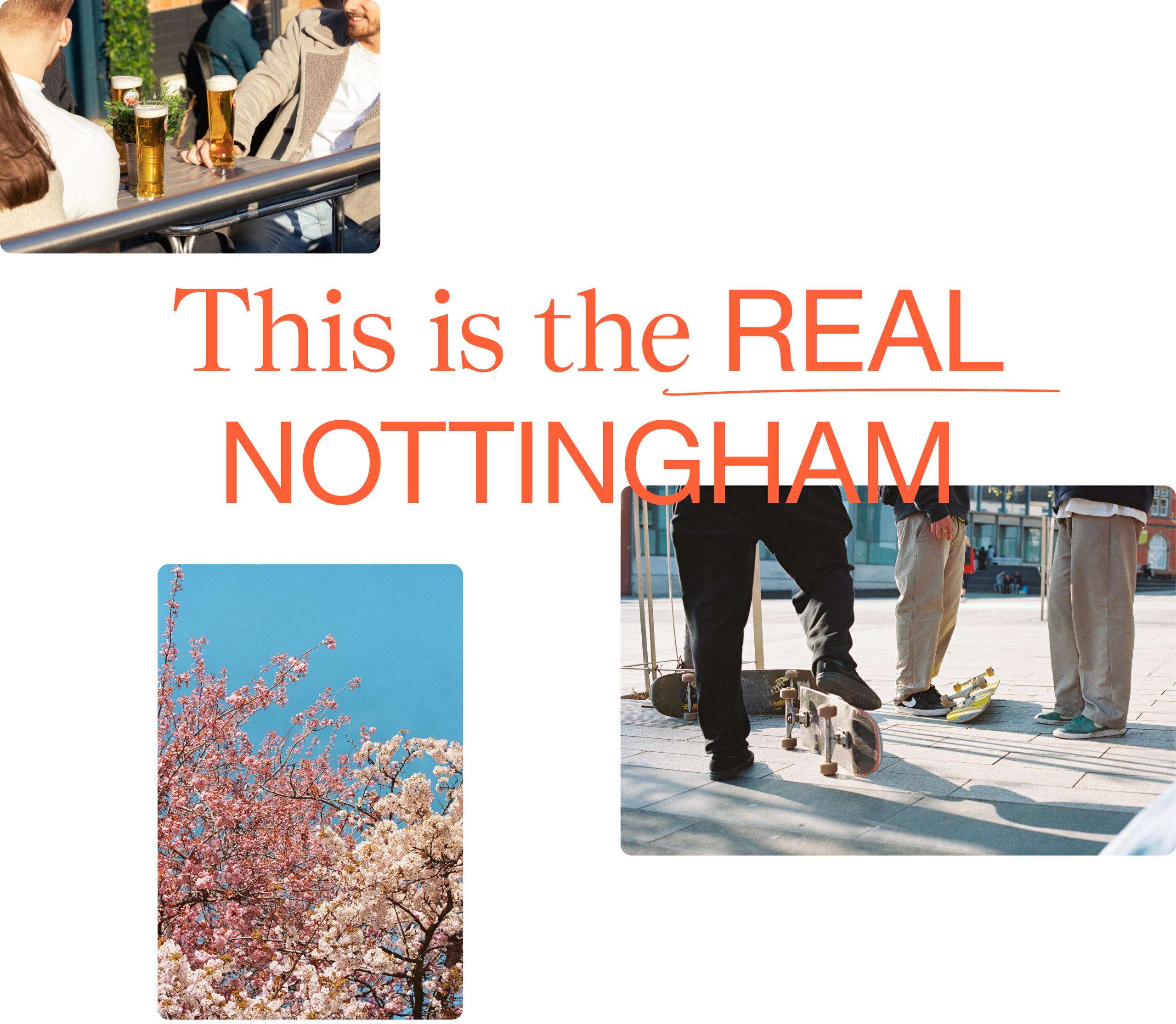
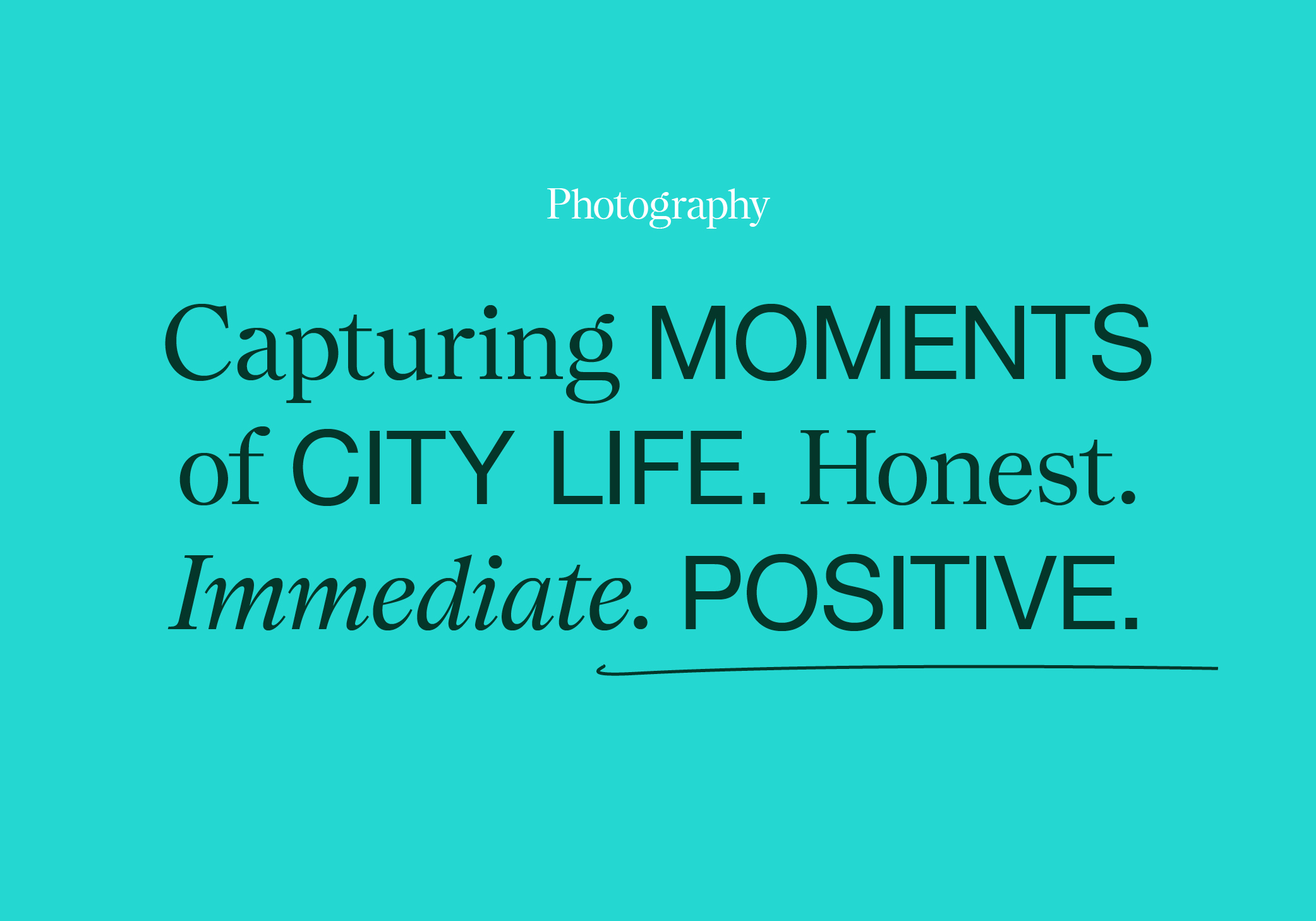
Honest, immediate and positive – unstaged photography captures moments of city life in their purest form.
Contrasting typefaces and a broad colour palette – taking cues from the architecture of the city – capture modernity and professionalism in equal measure, while enabling the brand to dial up the volume of its communications as required.

We’ve also supported the new brand with an extensive toolkit that includes social templates, updated literature and launch animations that provide context and background to the refresh for both consumers and members.

“Our brief was to create a brand fit for the rebel city. One that was truly representative, could instil pride in the area and set up It’s in Nottingham for an exciting future. The fresh, modern design language – combined with a playful but considered tone – celebrates Nottingham’s unity, genuine fearlessness and belief that anything is possible.”
Oliver Bingham
Managing Director, Cubic