Reuse
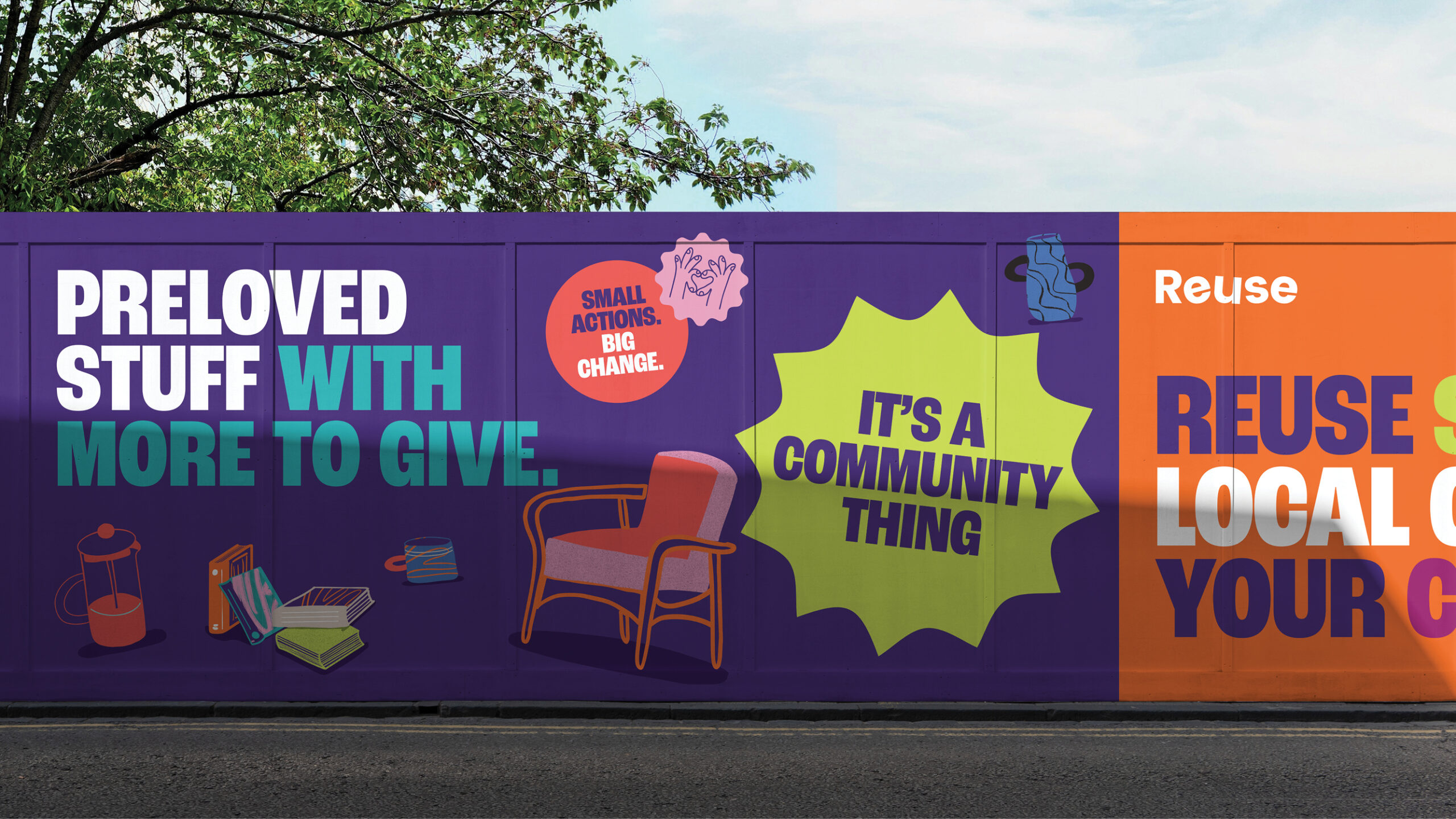
It's a community thing
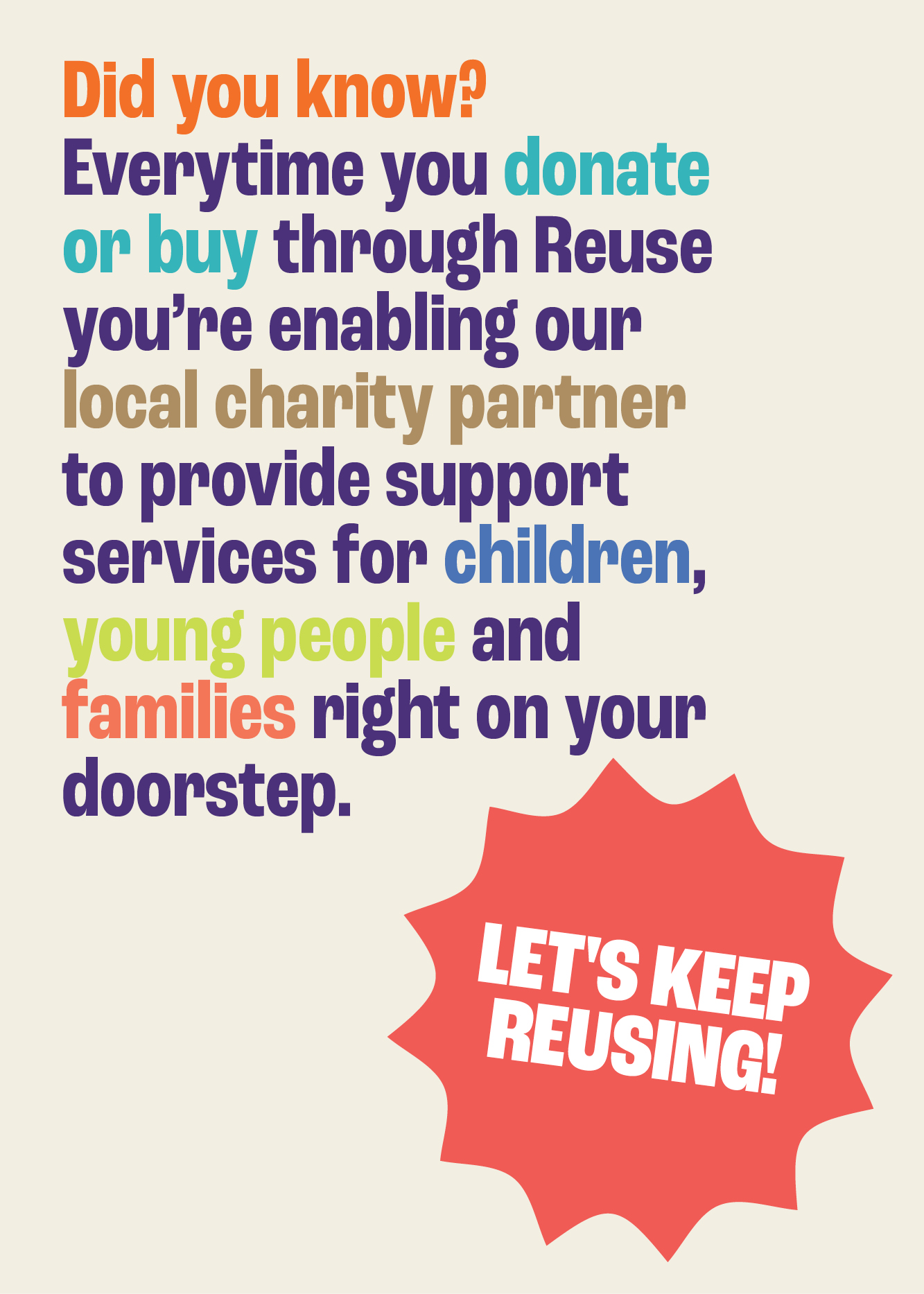
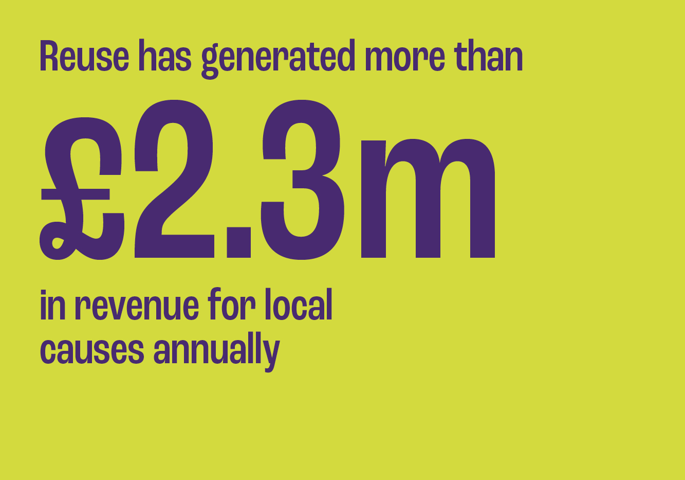
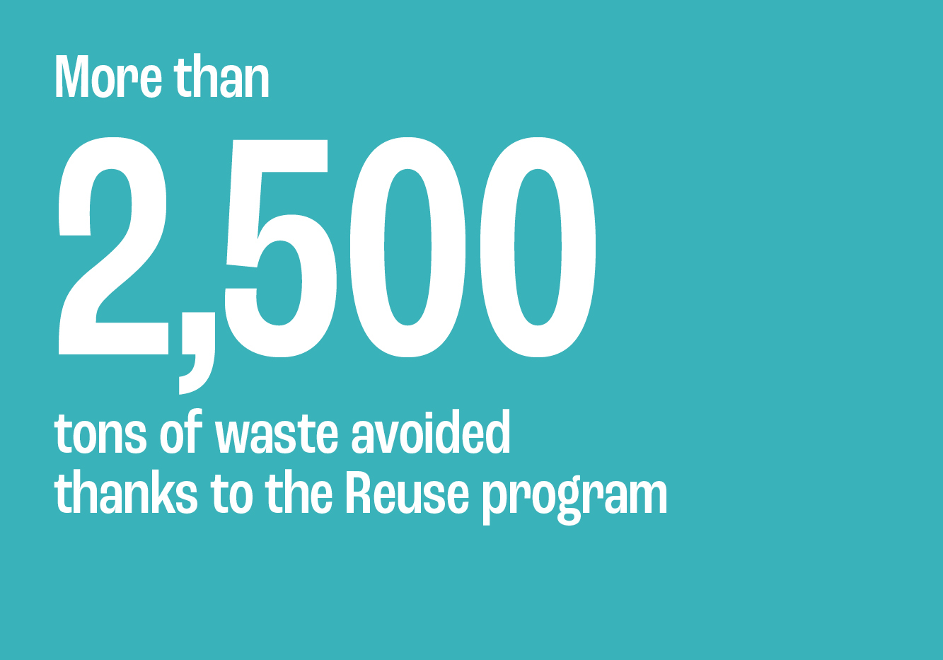
Reuse is an initiative that gives unwanted, donated items a second life – regenerating local impact by reselling them, with the proceeds supporting local community causes. While it had the foundations of something powerful its identity hadn’t kept pace with its purpose. It felt flat, institutional and too close to its roots in waste management. It needed a major shift — away from ‘recycling service’ and toward ‘social impact retailer.’ Less landfill, more local love.
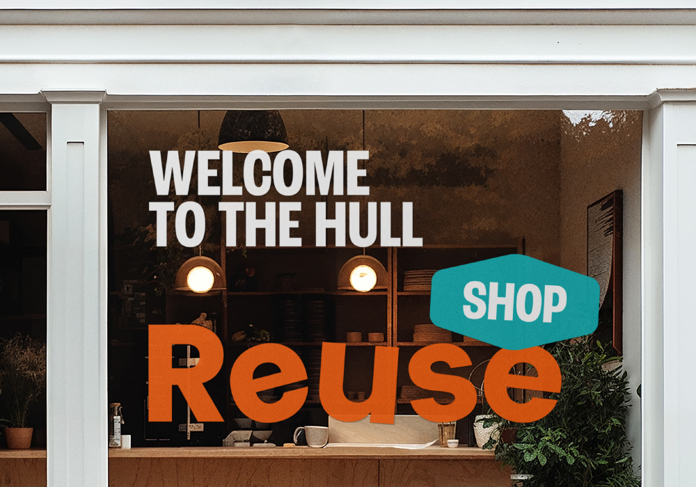
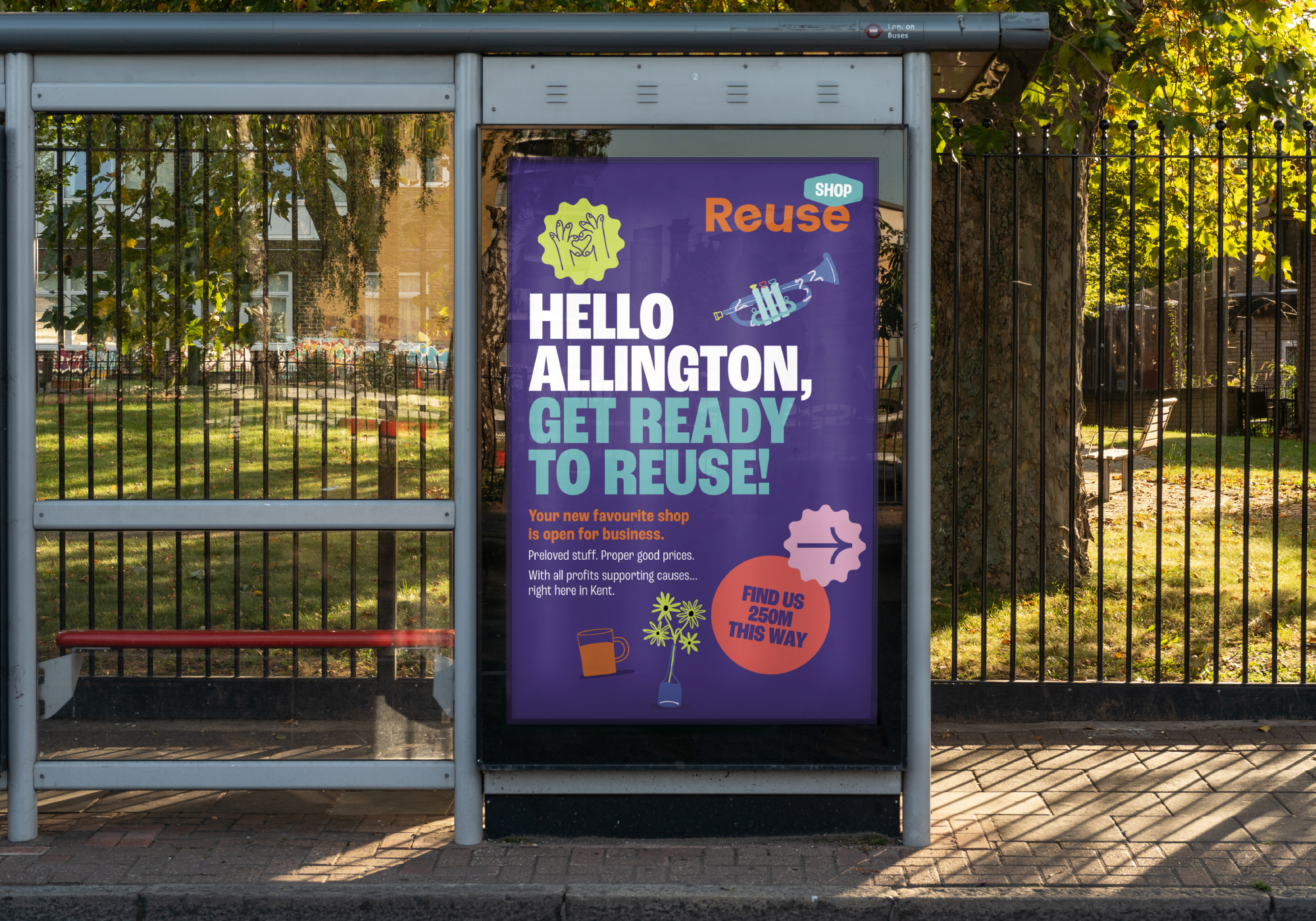
We delivered a brand refresh that did exactly that – clarifying Reuse’s role in the world and the communities it operates in through a robust brand strategy and a bold identity shift that added bags of personality, warmth and wit. The result is a brand that’s fit for the modern world and ready to connect with audiences and communities in more inventive, personal ways.
A warmer but bolder voice and identity for Reuse celebrates both impact and individuality.
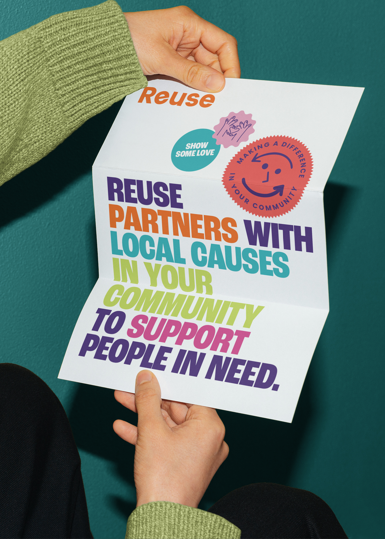
Designing a familiar face – we combined the recognisable recycle symbol with a smiley face to add a friendly, approachable charm to the brand.
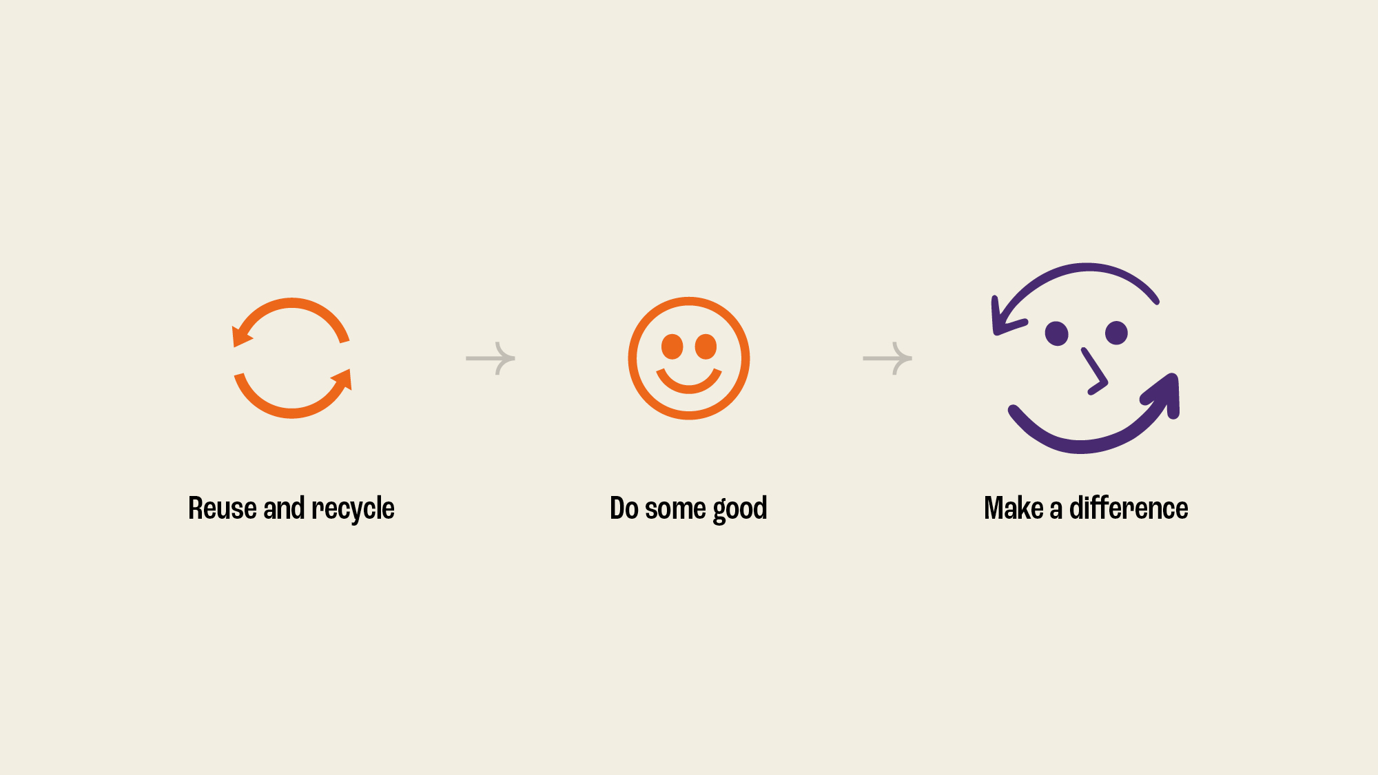
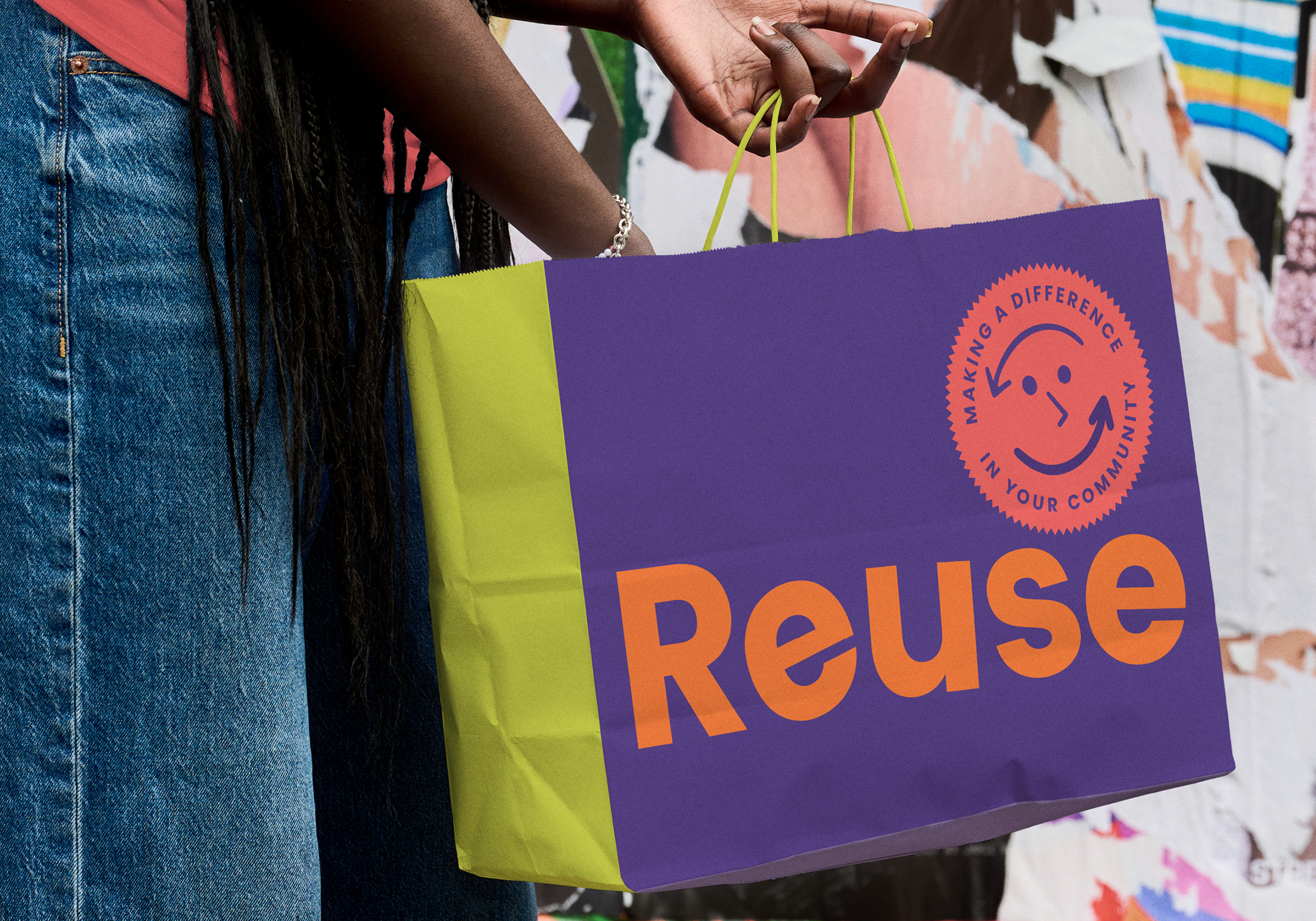
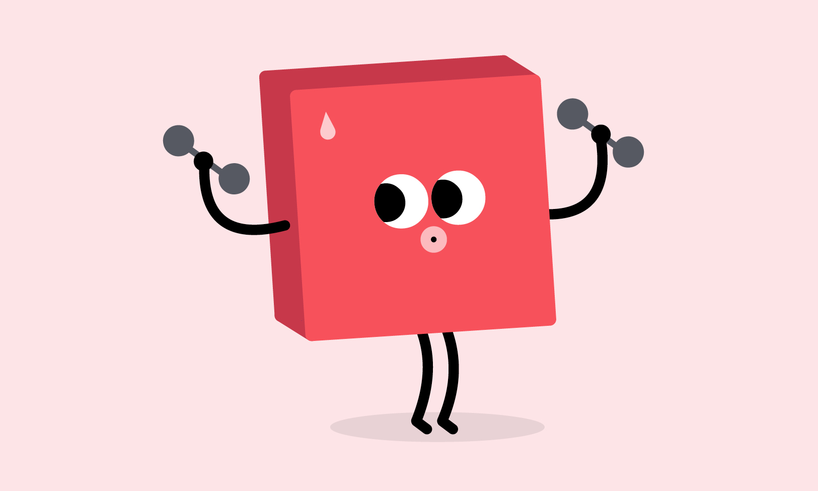
Supported by an expressive roundel, playful sticker devices, bolder type treatments and hand-crafted illustrations – created by Jack Carter – the elements of the flexible, purposeful identity come together to showcase optimism, vibrance and energy.
We clarified Reuse’s role in the world through a robust brand strategy and a bold identity shift that added bags of personality, warmth and wit.
The result is a brand that’s fit for the modern world and ready to connect with audiences and communities in more inventive, personal ways.